

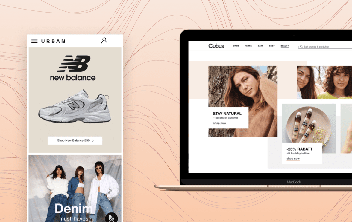
Developing software and UX/UI design that hits world market.
Varner Group, one of Scandinavia’s largest fashion retailers, owns several popular brands, including Cubus and Urban. Both were looking to modernize their digital presence and strengthen their eCommerce operations.
Cubus needed a refreshed platform to match the scale of its retail network across Northern Europe. Urban, known for its streetwear collections, wanted to build a more dynamic and conversion-oriented online store to compete with emerging digital fashion brands.
DevsData LLC partnered with Varner Group to deliver advanced software development, UX/UI redesign, and system integration for both brands. The collaboration improved usability, performance, and design consistency across platforms, while introducing a shared, scalable architecture that enabled faster rollout of new features and campaigns.
Cubus is one of Scandinavia’s largest clothing retailers, offering apparel, cosmetics, and lifestyle accessories. Its eCommerce platform serves as a key extension of hundreds of physical stores across Norway, Sweden, and Finland.
Urban targets a younger demographic with fashion inspired by urban culture. As customer behavior shifted toward mobile-first shopping and visually driven discovery, the existing platform no longer reflected the brand’s positioning or supported modern eCommerce expectations. The digital transformation aimed to create a more engaging and visually distinctive platform that aligned with Urban’s brand identity while improving user engagement and sales performance.
At the time of the project, both brands operated under Varner Group – one of the Nordic region’s most established fashion retail organizations. Founded in 1962 with a single store in Oslo, Varner has grown into a major retail group operating more than 1100 physical stores and six online stores across Norway, Sweden, Finland, and Iceland, employing over 3000 people. Its portfolio includes well-known brands such as Dressmann, Dressmann XL, Bik Bok, Carlings, Volt, Cubus, Junkyard, and Levi’s Store.
Following the redesign, Varner Group consolidated its streetwear brands by merging Urban into Junkyard, rebranding Urban’s physical stores under the Junkyard name. The move aligned Urban’s retail presence with Junkyard’s established eCommerce platform, supporting a more unified omnichannel experience across the Nordic market.
DevsData LLC was engaged to modernize the digital platforms for Cubus and Urban, focusing on user experience, performance, and design consistency across the Varner ecosystem. In addition to delivery, DevsData LLC advised Varner’s teams on eCommerce architecture, UX best practices, and platform scalability to support long-term digital development.
Key objectives:
Before the redesign, both platforms suffered from issues common in legacy retail systems. The technology stack had become outdated, limiting scalability and flexibility. The interfaces lacked visual appeal, and the overall user experience fell short of modern eCommerce standards.
Navigation paths were complex, causing friction during product discovery and checkout. The absence of a clear visual hierarchy and intuitive calls-to-action led to high cart abandonment rates. Additionally, the fragmented backend made it difficult to introduce new features or run promotional campaigns efficiently.
For Cubus, one of the main challenges was handling a vast product catalog while maintaining high website performance. The platform needed to support multiple categories, dynamic filtering, and seasonal updates without slowing down page load times. Another focus area was aligning the digital experience with the in-store brand identity to ensure consistency across all customer touchpoints.
For Urban, the situation was different. The brand wanted a digital presence that reflected its youthful, trend-driven image. The existing design lacked the energy and storytelling needed to connect with a younger audience. The checkout flow was long and outdated, discouraging mobile users, an essential segment for Urban’s target market. The new platform had to combine bold aesthetics with a seamless, fast shopping experience that encouraged repeat engagement.
Finally, both brands faced a shared challenge: international accessibility. Their previous platforms supported only Scandinavian languages, limiting their ability to scale across European markets. Varner Group approached DevsData LLC as a technology and design partner capable of combining hands-on delivery with architectural and UX advisory support, helping internal teams define a scalable foundation for long-term digital growth.
DevsData LLC began the engagement with a structured business and technical analysis for both brands. The team reviewed existing analytics data, evaluated key eCommerce KPIs (including conversion, drop-off rates, and device usage), and assessed current merchandising and checkout flows against commercial objectives. In parallel, DevsData LLC conducted UX audits of critical user journeys, mapping paths from landing pages to checkout, identifying friction points in navigation, content hierarchy, and payment steps, and analyzing performance bottlenecks that impacted conversion and user engagement.
For Cubus, the emphasis was on scalability and structure. DevsData LLC approached this by first analyzing the size and behavior of the product catalog, including category depth, filtering logic, and seasonal update patterns. Based on this analysis, the team redesigned the information architecture, defined a clearer category hierarchy, and standardized product listing and detail page templates.
On the technical side, frontend modules were refactored into reusable components, and data-loading strategies were optimized to ensure fast page rendering even during high-traffic periods. The deliverables included a restructured catalog architecture, optimized navigation and filtering flows, and a streamlined checkout process with fewer steps between entry and purchase. The result was a cleaner, more efficient purchasing flow that improved operational throughput and made ongoing catalog updates easier for internal teams.
For Urban, the work centered on creative design and user engagement. DevsData LLC began by analyzing Urban’s target audience, mobile usage patterns, and existing content presentation to understand how users interacted with products and brand storytelling. Based on these insights, the team defined a visual direction inspired by fashion editorials, focusing on bold imagery, clean typography, and clear content hierarchy.
The deliverables included redesigned product listing and product detail page templates, immersive product presentations with enhanced imagery, and interactive carousel components optimized for mobile browsing. These elements were implemented within the shared Design System to ensure usability and performance standards were maintained. The refreshed interface strengthened Urban’s brand identity while delivering a fast, intuitive shopping experience.
Throughout the project, DevsData LLC worked closely with Varner Group’s marketing, analytics, and product teams within an iterative delivery model that combined regular planning sessions, design reviews, and feedback cycles. Responsibilities were clearly defined to enable fast decision-making, while priorities were continuously refined based on business goals and release timelines. Design and UX changes were validated using A/B testing and behavioral analytics tools such as Hotjar, Google Analytics, and FullStory, with insights translated directly into backlog updates covering layout, messaging, and CTA improvements. This collaborative, data-driven approach ensured steady progress while aligning design decisions with measurable engagement and conversion outcomes.
This approach mirrors the methodology used in several of our other design-driven projects for corporate clients, where iterative design, rapid feedback cycles, and close collaboration with internal teams play a central role.
By combining data-driven decisions with design expertise, the project struck a balance between performance and business outcomes, laying a strong foundation for sustainable digital growth across both brands.
Do you have web development needs?
A key deliverable of the project was a flexible and reusable Design System implemented across both Cubus and Urban platforms. It ensured consistency, scalability, and long-term maintainability of design and code.
The system included:
This framework was created through a structured Design System development process led by DevsData LLC. The team began by auditing existing UI components, brand guidelines, and recurring design patterns across both platforms, identifying overlaps and inconsistencies. Based on this analysis, DevsData LLC defined a shared set of design principles, interaction rules, and component standards, which were then translated into reusable UI elements and documented usage guidelines. These components were built, tested, and refined in parallel with development, ensuring they worked across devices and use cases. As a result, Varner’s internal teams were able to quickly adapt pages for new campaigns, products, or seasonal launches while preserving visual coherence and streamlining collaboration between designers, developers, and marketing teams, consistent with DevsData LLC’s approach to large-scale Design System engagements.
DevsData LLC rebuilt both platforms using a modern, modular architecture centered around React and TypeScript, paired with Next.js to ensure fast rendering and smooth performance across devices. The design workflow relied on Figma and Storybook, allowing designers and developers to work within a unified component library that kept UX consistent across both brands.
On the backend, the team used Node.js along with a mix of REST and GraphQL APIs to handle data flows and connect the platforms to Varner’s existing retail systems, including inventory, pricing, and customer accounts. The infrastructure was deployed on AWS with CloudFront as the CDN, supported by Docker-based containerization and GitHub Actions for automated CI/CD. This setup delivered a stable, mobile-optimized user experience with real-time data synchronization and reliable transaction flows, giving both Cubus and Urban a solid technical foundation for long-term, multi-brand growth.
The collaboration between DevsData LLC and Varner Group delivered two modern, high-performing eCommerce platforms with improved usability and stability.
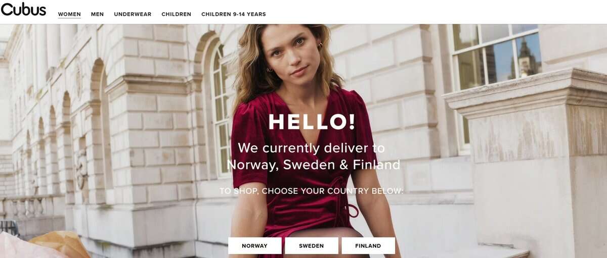
For Cubus, the redesigned structure simplified navigation, shortened the checkout process, and improved site speed. The scalable architecture made it easy to introduce new product lines and seasonal updates, supporting continuous business growth.
For Urban, the new editorial-style design increased user engagement and time on site. The platform’s cleaner interface and faster mobile performance led to higher conversion rates and a stronger digital identity aligned with the brand’s youthful image.
This project was a perfect example of how design and engineering can come together to create measurable business results. Working with Varner’s team was incredibly collaborative, and seeing both platforms evolve into high-performing, modern eCommerce solutions was something we’re truly proud of.
Both brands benefited from the shared Design System, which enabled consistent updates and faster rollout of new features. Post-launch analytics confirmed higher conversion and order value across both platforms. Urban’s enhanced online presence also contributed to its acquisition by Junkyard.no, confirming the lasting business impact of the redesign.
The collaboration between DevsData LLC and Varner Group went far beyond a standard redesign. It combined strategy, software engineering, and design to modernize two distinct yet connected eCommerce ecosystems.
Both Cubus and Urban now operate on stable, high-performance platforms that reflect their brand identities, enhance user experiences, and support measurable business growth. For Varner Group, the project proved how technology-driven design and user-focused architecture can translate directly into commercial success and long-term scalability across multiple retail brands.
The partnership reinforced DevsData LLC’s reputation as a trusted technology partner for leading companies in fashion and eCommerce – delivering practical solutions that connect strong engineering with clear business outcomes.
Is this relevant to your situation? If you’re facing any of the challenges Cubus or Urban encountered, your organization may be ready for a transformation as well. Consider the questions below:
Quick self-assessment
If you answered “yes” to any of the above, your platform may need the same kind of strategic redesign and engineering support that helped Varner Group elevate Cubus and Urban.
We’d be happy to review your current setup or discuss potential improvements. Contact us at [email protected] or visit www.devsdata.com to learn more.
DevsData – your premium technology partner
DevsData is a boutique tech recruitment and software agency. Develop your software project with veteran engineers or scale up an in-house tech team of developers with relevant industry experience.
Free consultation with a software expert
🎧 Schedule a meeting
FEATURED IN


DevsData LLC is truly exceptional – their backend developers are some of the best I’ve ever worked with.”
Nicholas Johnson
Mentor at YC, serial entrepreneur


 Build your project with our veteran developers
 Explore the benefits of technology recruitment and tailor-made software
 Learn how to source skilled and experienced software developers


Categories: Big data, data analytics | Software and technology | IT recruitment blog | IT in Poland | Content hub (blog)
